

An Angular sample application that includes selecting, adding, updating, and deleting data with HttpClient service, reactive forms for object and array types, in-line data editing, custom input validations, and various other features.
- Download NgDataCrud_AspNetCore_Cli.zip – 275.8 KB
- Download NgDataCrud_AspNet5_Cli.zip – 195.5 KB
- Download SM.Store.Data.Api.zip – 453.4 KB
Introduction
My previous article provides a sample application and discussions for comprehensive CRUD operations with AngularJS 1x and Web API. I have re-written the sample applications that work with the latest version of the Angular. Although there are no major differences of data operations and workflow in respect to user cases between the new and old sample applications, the new versions follow the Angular component tree structures and use the reactive forms for the data display, inputs, and submissions.
The features demonstrated in the article and sample application include:
- Adding and editing data using the reactive form for the single data object on modal dialogs.
- Inline and dynamically adding and editing multiple data rows in a table using the reactive form and
FormArray. - Deleting multiple and selective data records using reactive forms.
- Dynamically displaying refreshed data after adding, updating, or deleting processes with reactive form approaches.
- Custom and in-line input data validations for reactive forms in the pattern of
on-changeprocess andon-blurerror message display. - Dirty warning when leaving pages related to both Angular internal router and external re-directions.
- Full support of RESTful API data services.
- Easy setup for running the sample application.
The sample application ports these Angular components or directives as subfolders into the project root. Audiences can go to original posts or source code repositories if details are needed.
Build and Run Sample Application
The downloaded sources include the Angular 6 CLI applications with two different Visual Studio project types.
- Required libraries and tools installed globally on your local machine for all project types:
- node.js (version 8.11.x LTS is recommended).
- Angular CLI (recommended version 6.1.3 or above).
- Required libraries and tools for individual project types:
- AspNetCore_Cli project: Visual Studio 2017 Update 15.7.5 (or above) and DotNET Core 2.1 SDK (2.1.302).
- AspNet5_Cli project: Visual Studio 2017 or Visual Studio 2015 Update 3 (or above).
- Download and unzip the source code files to your local work places.
- For the NgDataCrud_AspNet5_Cli project type, go to the SM.NgDataCrud.Web\ClientApp folder. For the NgDataCrud_AspNetCore_Cli project type, go to the SM.NgDataCrud.Web\AppDev folder. Sequentially double click and run the npm_install.bat and ng_build.bat files.Note that the
ng buildcommand may need to be executed everytime after making any change in the TypeScript/JavaScript code. Whereas the execution ofnpm installis just needed whenever there is any update with the node module packages. - Open any project type with the Visual Studio and rebuild the solution.
- You can view the Angular source code structures in the ClientApp or AppDev folder. Since all active Angular UI source code pieces in the SM.NgDataCrud.Web project folders and files are pure client scripts, you can move these folders and files to any other project type with different bundling tools, or even to different platforms.
- The SM.NgDataCrud.Web application works with the corresponding RESTful API data service and underlying database which are included in the downloaded sources. I recommend setting up the SM.Store.CoreApi solution in your local machine. After opening and building the SM.Store.CoreApi solution with another Visual Studio instance, you can select one of available browsers from the IIS Express button dropdown on the menu bar, and then click that button to start the data service API application.No database needs to be set up initially since the API application uses the in-memory database with the current configurations. The built-in starting page will show the response data in the JSON format obtained from a service method call, which is just a simple way to start the service application with the IIS Express on the development machine. You can now minimize the Visual Studio screen and keep the data service API running on the background. You can view this post for the details of the SM.Store.CoreApi data service project.If you would like to use the legacy ASP.NET Web API 2 version of the data services, you can refer to the AngularJS 1.x version of the article for how to set up the data service project on your machine. The SM.Store.WebApi solution code is also included in the downloaded source of this article.Before you run the sample application, you may check the RESTful API data service URL path in the ../app/Services/app.config.ts file to make sure that the correct
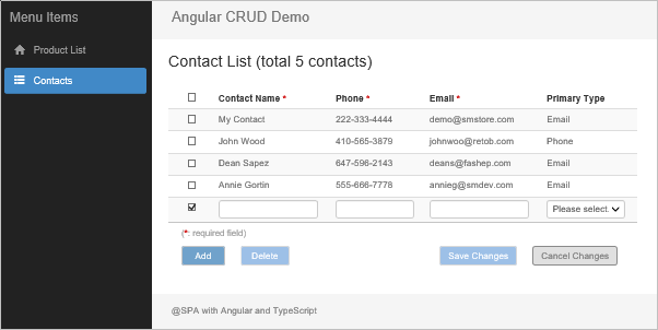
WebApiRootUrlvalue is set for the running data services. - When all these are ready, press F5 to start the sample application. You can enter some parameters, or just leave all search parameter field empty, on the Search Products panel and then click the Go. The Product List grid should be displayed.Selecting the Contacts left menu item will open the page with contact list filled in a table. The inline table editing feature is implemented on this page, which will be shown in the later section.
Adding and Updating Data Using Modal Dialogs
This topic is the same as the AngularJS version so that I won’t repeat those in common for the code and user case workflow. The major change, besides the Angular version itself, in the code is that the new version uses the reactive form pattern for the data display and editable field entries. The reactive form here is for a single object model that is shown and editable on the popup modal dialog. The major implementation is outlined below.
- In the product.component.html, specify the
[fromGroup]directive in the<form>tag andfromControlNamedirective in the form’s editable field elements.Hide Copy Code<form [formGroup]=”productForm” (ngSubmit)=”saveProduct(productForm)”> <input type=”text” name=”productName” formControlName=”productName” /> – – – </form> - In the product.component.ts , create an instance of the
FromGroupand set the names with options for all form controls in thengOnInitmethod. The optional validator settings will be discussed in the later section.Hide Copy Codethis.productForm = new FormGroup({ ‘productName’: new FormControl(”, Validators.required), ‘category’: new FormControl(”, [Validator2.required()]), ‘unitPrice’: new FormControl(”, [Validator2.required(), Validator2.number(), Validator2.maxNumber({ value: 5000, label: “Price” })]), ‘status’: new FormControl(”), ‘availableSince’: new FormControl(”, Validator2.DateRange({ minValue: “1/1/2010”, maxValue: “12/31/2023” })) }); - Define and use a custom or base model object for the product data:Hide Copy Codemodel: any = { product: {} };This product object will then be used to receive the data response from the AJAX call and as the data source to populate the reactive form controls.Hide Copy Codelet pThis: any = this;
this.httpDataService.get(url).subscribe(
data => {
//Format and conversion.
data.UnitPrice = parseFloat(data.UnitPrice.toFixed(2));
data.AvailableSince = { jsdate: new Date(data.AvailableSince) };
//Assign data to class-level model object.
pThis.model.product = data;
//Populate reactive form controls with model object properties.
pThis.productForm.setValue({
productName: pThis.model.product.ProductName,
category: pThis.model.product.CategoryId,
unitPrice: pThis.model.product.UnitPrice,
status: pThis.model.product.StatusCode,
availableSince: pThis.model.product.AvailableSince
});
},
– – -When submitting edited data, the base product model is updated from the reactive form controls and acts as the request object for the HTTP Post call.Hide Copy Code//Assign form control values back to model.
this.model.product.ProductName = productForm.value.productName;
this.model.product.CategoryId = productForm.value.category;
this.model.product.UnitPrice = productForm.value.unitPrice;
this.model.product.StatusCode = productForm.value.status;
if (productForm.value.availableSince) {
this.model.product.AvailableSince = productForm.value.availableSince.jsdate;
}
– – –
this.httpDataService.post(ApiUrl.updateProduct, this.model.product).subscribe(
data => {
– – –
}
);Why using the class-level base model object instead of directly binding data to the built-in form group/controls model? There are at least these advantages of doing so.
- The form control names or character cases may not the same as the response data fields (or database columns). For example, the names of
model.productproperties and form controls are different or in different character cases, such as the “CategoryId” vs “category” and the “StatusCode” vs “status”. Having a base model can keep those differences constant across the entire class. - Some fields required in the base model only for data integrity and processing needs can easily be excluded from the form controls, such as
ProductId. - The base model object is a good source of keeping original loaded data which can be used anytime for dirty comparisons manually, if needed, or restoring the original data display. Note that the form group is not mutable to the base model object instance. Each form control gets the values from individual base model properties.
- The form control names or character cases may not the same as the response data fields (or database columns). For example, the names of
- For adding a new product, the popup dialog can also be used for repeated data record entries, just like its AngularJS ancestor. Between any two entries, both the base model object instance and form group will be reset to the empty value status. The first input field,
Product Name, will also be focused for quick key-typing operations.Hide Copy CoderesetAddForm() { this.model.product = { ProducId: 0, ProductName: “”, CategoryId: “”, UnitPrice: “”, StatusCode: “”, AvailableSince: “” }; this.productForm.reset({ productName: this.model.product.ProductName, category: this.model.product.CategoryId, unitPrice: this.model.product.UnitPrice, status: this.model.product.StatusCode, availableSince: this.model.product.AvailableSince }); this.focusProductName(); }Here shows the example of the Update Product modal dialog screen.
In-line Adding and Updating Data
With the Angular reactive form and FormArray structures, the two-way data binding and grid in-line data adding, editing, and deleting operations on the Contact List page are more efficient, elegant, and easier to be implemented than its AngularJS version although the look-and-feel on the screen is the same. The only change regarding the user case workflow is to simplify the status settings. The previous Edit and Add statuses have been merged into the Update status.
- Read: This is the default status whenever the data is initially loaded or refreshed. No input element is shown except for those cleared checkboxes in the first column. This screenshot is the same shown in the first section.
- Update: Checking the checkbox in any existing data row or clicking Add button will enable the Update status for which all input fields in the existing row or an add-new row is shown. Multiple rows can be selected and/or added for editing and submission all at once. The user can delete an existing row if it is selected and no field value has been changed. The user can also cancel the edited changes by unselecting rows or clicking the Cancel Changes button any time.
In the Update status, two count numbers, addRowCount and editRowCount, are used to identify the workflow of adding new rows or editing existing rows. The count numbers will increase or decrease based on the number of rows to be added or edited. The saveChanges method submits the updates for both edited or added data rows based on the count numbers.Hide Copy Code
if (this.editRowCount > 0) {
    //Submit edited contact data.
    this.httpDataService.post(ApiUrl.updateContacts, editItemList).subscribe(
	 data => {
	   if (this.addRowCount > 0) {
		   //Process add-new rows if exist.
		   this.doSaveAddNewRows(temp2);
		  }
	   else {
		  //Refresh table.
		  this.getContactList();
	   }
	);
}
else if (this.addRowCount > 0) {
	this.doSaveAddNewRows(temp2);
}
It’s somewhat complex to implement the FormGroup and FormArray with child FormControl items for this grid in-line editing form but below are the major tasks done using these Angular structures.
Creating HTML Elements with FormArray Arrangement
The structure shown below is simplified without the elements and attributes for styles, validators, conditional checkers, and buttons. Here the contactControlList is a variable set in the component class referencing to the contactForm.controls.contactFmArr.controls. The [formGroupName]="$index" is a nested FormGroup instance as an element of the contactFmArr array.Hide Copy Code
<form [formGroup]="contactForm">
    <div formArrayName="contactFmArr">
        <table>
          - - -
          <tbody>
             <tr [formGroupName]="$index" *ngFor="let item of contactControlList; let $index = index">
                <td>
                    <input type="text" formControlName="ContactName"/>
                </td>
                </td>
                  - - -
                </tr>
          </tbody>
       </table>
    </div>
</form>
Populating FormArray Instance and Binding Data to Form Controls
After obtaining the data from the AJAX call, the original contact data list is deep-cloned for possible record-based cancel or undo later. The code then calls the reusable method to set contact data values from the array.Hide Copy Code
//Make deep clone of data list for record-based cancel/undo.
this.model.contactList_0 = glob.deepClone(data.Contacts);

this.resetContactFormArray();
Within the resetContactFormArray() method, the forEach loop adds the each nested FormGroup instance as an element into the contactFmArr array.Hide Copy Code
resetContactFormArray() {
    let pThis: any = this;
    - - -
    //Need to use original structures, not referred contactControlList.
    pThis.contactForm.controls.contactFmArr.controls = [];
    pThis.model.contactList_0.forEach((item: any, index: number) => {
        pThis.contactForm.controls.contactFmArr.push(pThis.loadContactFormGroup(item));
        pThis.checkboxes.items[index] = false;
    });
    //Set reference for data binding.
    pThis.contactControlList = pThis.contactForm.controls.contactFmArr.controls;
}
loadContactFormGroup(contact?: any): FormGroup {
    return new FormGroup({
        //Dummy control for cache key Id.
        "ContactId": new FormControl(contact.ContactId),
        "ContactName": new FormControl(contact.ContactName, Validators.required),
        "Phone": new FormControl(contact.Phone, [Validator2.required(), Validator2.usPhone()]),
        "Email": new FormControl(contact.Email, [Validator2.required(), Validator2.email()]),
        "PrimaryType": new FormControl(contact.PrimaryType)
    });
}
The code for the validators can be ignored this time (details will be in the later section). I also use the FormGroup, instead of the FormBuilder object because the latter doesn’t support the option “updateOn” which could be used and tested in the code (see later section for validators). In addition, the ContractId control defined here is to hold the key Id values for which no equivalent element is set on the HTML view. Fortunately, the array element form group doesn’t complain on it.
Dynamically Adding FormGroup Instance for New Row
Since the loadContactFormGroup method is already defined, creating an instance of the FormGroup as an element of contactFmArr array is quite straightforward.Hide Copy Code
//Add empty row to the bottom of table.
let newContact = {
    ContactId: 0,
    ContactName: '',
    Phone: '',
    Email: '',
    PrimaryType: 0
};
this.contactForm.controls.contactFmArr.push(this.loadContactFormGroup(newContact));
When the new FormGroup instance is added into the contactFmArr array with the name of array index number, a new empty row is automatically appended to the table and shown on the page.
Row Selections with Standalone Checkbox Array
An input element of checkbox type is added into the first <td> element within the territory of the array element form group. However, the checkbox is not included in the index-based form group. It uses the template-driven pattern with the ngModel directive and the standalone option.Hide Copy Code
<tr [formGroupName]="$index" *ngFor="let item of contactControlList; let $index = index">
    <td>
        <input type="checkbox"

            [(ngModel)]="checkboxes.items[$index]"

            [ngModelOptions]="{standalone: true}"

            (change)="listCheckboxChange($index)" />
    </td>
    - - -
</tr>
This is a very nice feature in that we can use the reactive form in general but any standalone form control that isn’t within the scope of the form group and form array. Using this approach, any checkbox action doesn’t affect the overall status of the data operations of the form group and form array. For example, we can now monitor if the form array is dirty without being worried about the unexpected “dirty form” caused by clicking a checkbox to select a row.
The checkboxes.items array is defined in the ContactsComponent class and all elements are set to false by default in the forEach loop of the resetContactFormArray() method:Hide Copy Code
this.checkboxes.items[index] = false;
The index numbers of the checkboxes.items array are always synchronized with the contactFmArr array for any data row operations.
When adding a new row:Hide Copy Code
//Add element to contactFmArr.
(<FormArray>this.contactForm.controls.contactFmArr).push(this.loadContactFormGroup(newContact));
//Add element to checkboxes.items.
this.checkboxes.items[this.checkboxes.items.length] = true;
When removing an existing row:Hide Copy Code
//Remove element from contactFmArr.
(<FormArray>this.contactForm.controls.contactFmArr).removeAt(listIndex);
//Remove element from checkboxes.items.
this.checkboxes.items.splice(listIndex, 1);
Cancelling Editing Tasks
The logic for cancelling editing tasks in the sample application is much simplified than the AngularJS versionalthough the ways to initiate the cancel processes are the same.
- Uncheck any checked row by calling the
cancelChangeRow(listIndex)method. You can see the code comment lines for explanations. The “discard changes” warning confirmation is provided by the checkbox click-event method from the caller, which is not shown here. Note that the form array’sremoveAt(listIndex)method for thecontactFmArrand thesplice(listIndex, n)method for thecheckboxes.itemsautomatically handle the array index shift if removing an element in any middle position of the array.Hide Shrink Copy CodecancelChangeRow(listIndex) { //Reset form if no checkbox checked, else do individual row. let hasChecked: boolean = false; for (let i = 0; i < this.checkboxes.items.length; i++) { if (this.checkboxes.items[i]) { hasChecked = true; break; } } if (!hasChecked) { //Reset entire array. this.resetContactFormArray(); } else { if (listIndex > this.maxEditableIndex) { //Remove add-new row. (<FormArray>this.contactForm.controls.contactFmArr).removeAt(listIndex); this.checkboxes.items.splice(listIndex, 1); //Reduce addRowCount. this.addRowCount -= 1; } else { //Edit row: reset array item. (<FormArray>this.contactForm.controls.contactFmArr).controls[listIndex].reset(glob.deepClone(this.model.contactList_0[listIndex])); //Reduce editRowCount. this.editRowCount -= 1; } } } - Click the Cancel Changes button or uncheck the top checkbox, if it’s checked, to call the
cancelAllChangeRowsmethod. This will clear all edited existing rows and added new rows. The form will then be reset to its original loaded situation. If no data value is changed after selecting any existing row, the action will simply uncheck any checked checkbox and return the form to the Read status.Hide Shrink Copy CodecancelAllChangeRows(callFrom) { //Check dirty for call from topCheckbox only. //Cancel button is enabled only if contactFmArr is dirty. if ((<FormArray>this.contactForm.controls.contactFmArr).dirty || callFrom == “cancelButton”) { this.exDialog.openConfirm({ title: “Cancel Confirmation”, message: message }).subscribe((result) => { if (result) { //Reset all. pThis.resetContactFormArray(); } else { //Set back checked. if (callFrom == “topCheckbox”) pThis.checkboxes.topChecked = true; } }); } else { //Uncheck all checkboxes in edit rows. for (let i = 0; i <= this.maxEditableIndex; i++) { if (this.checkboxes.items[i]) { this.checkboxes.items[i] = false; } } this.checkboxes.topChecked = false; this.editRowCount = 0; } }
Input Data Validations
The Angular built-in and basic validators usually do not meet the needs by a business data application. Thus, I created full-range custom sync validators specifically for reactive forms. All validator functions are included in the Validator2 class. Audiences can see the details in the file, app/InputValidator/reactive-validator.ts. But here shows an example of the function used for validating an email address:Hide Copy Code
static email(args?: ValueArgs): ValidatorFn {
    return (fc: AbstractControl): ValidationErrors => {
        if (fc.value) {
            let reg = /^\w+([-+.']\w+)*@\w+([-.]\w+)*\.\w+([-.]\w+)*$/;
            if (args && args.value) {
                //Set first arg as message if error text passed from the first arg.
                if (typeof args.value === "string") {
                    args.message = args.value;
                }
                else {
                    reg = args.value;
                }
            }
            const isValid = reg.test(fc.value);
            let label = "email address";
            if (args && args.label) label = args.label;
            const errRtn = {
                "custom": {
                    "message": args && args.message ? args.message : "Invalid " + label + "."
                }
            };
            return isValid ? null : errRtn;
        }
    }
}
The validators are set for the form controls when initiating the instance of the form group containing these form controls. The code below has already partially been shown in previous sections, but we focus on the option arguments for validators this time.
For the Product form:Hide Copy Code
this.productForm = new FormGroup({
    'productName': new FormControl('', Validators.required),
    'category': new FormControl('', [Validator2.required()]),
    'unitPrice': new FormControl('', [Validator2.required(), Validator2.number(), Validator2.maxNumber({ value: 5000, label: "Price" })]),
    'status': new FormControl(''),
    'availableSince': new FormControl('', Validator2.DateRange({ minValue: "1/1/2010", maxValue: "12/31/2023" }))
});
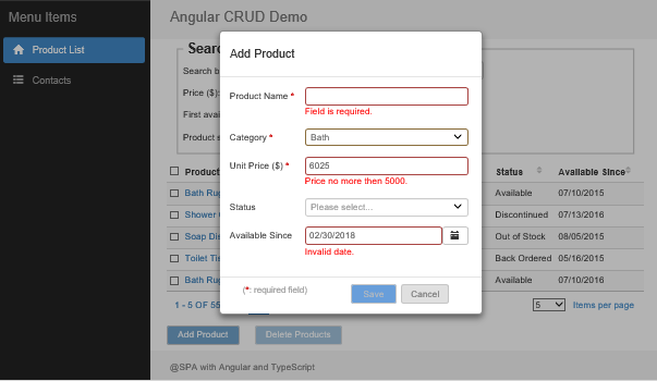
The Product form validation results are displayed like this.
For the contact form:Hide Copy Code
loadContactFormGroup(contact?: any): FormGroup {
    return new FormGroup({
        //Dummy control for cache key Id.
        "ContactId": new FormControl(contact.ContactId),
        "ContactName": new FormControl(contact.ContactName, Validators.required),
        "Phone": new FormControl(contact.Phone, [Validators.required, Validator2.usPhone()]),
        "Email": new FormControl(contact.Email, [Validator2.required(), Validator2.email()]),
        "PrimaryType": new FormControl(contact.PrimaryType)
    });
}
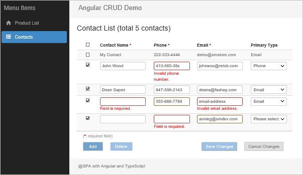
The Contact form validation results are displayed like this.
Some details you may need to know for setting and using the validators.
Mixing built-in and custom validators
You can still use the built-in Validators, if available, together with the custom Validator2, even for the same form control. See the example of the validator settings shown above for the contact.Phone.
Passing arguments for the custom validators
Any method of the custom Validate2 accepts an argument of object type, either the ValueArgs or RangeArgs, which are defined in the validator-common.ts.Hide Copy Code
export class ValueArgs {
    value?: any;
    label?: string;
    message?: string;
}
export class RangeArgs {
    minValue: any;
    maxValue: any;
    label?: string;
    message?: string;
}
All properties of the argument objects are optional except the minValue and maxValue that are mandatory for any validation on a date or number range (see the above code to validate the date range for the availableSince field input).
If validating any size of single number, date, or text length, the value property of the ValueArgs is also needed since no default value can be pre-set for the corresponding validators (see the above code of maxNumbervalidator for the unitPrice field input.).
Displaying Inline error messages
In the sample application, any error message is displayed with the reusable ValidateErrorComponenttriggered from the errors tag which is placed just under each HTML input element, for examples:Hide Copy Code
<errors [control]="productForm.controls.unitPrice"></errors>

<errors [control]="contactControlList[$index].controls.Email" ></errors>
Where the form control itself is passed to the ValidateErrorComponent in which the error messages are categorized and rendered to its child template. I do not list code of that component class here. Audiences can view the code in the app/InputValidator/validate-error.component.ts file if interested.
Handling on-change and on-blur scenarios associated with the validations
The Angular 2 and 4 only uses the default on-change setting for updating models and thus the validation workflow. The Angular 5 provides the option to set the updateOn value on the FormGroup or the FormControllevel although the equivalent settings were in the AngularJS. Whatever the updateOn setting applies, the time points of model updates and input validations influence both the process workflow and visual effects.
To help understand the logic in this section, it’s necessary to list the following categories of commonly input data for validations:
- All or none: such as required field.
- Type: such as numeric or text.
- Size: such as minimum and/or maximum numbers.
- Exclusive: such as no particular symbol allowed.
- Expression: such as email, phone, or password. The date value is also a special kind of expressions.
Now let’s play the data inputs and look at the error message display when using the option { updateOn: 'change' }. The code doesn’t need to explicitly be there since it’s the default setting. We are also not concerned on the performance impact this time.
- For all data input categories, except the Expression, an error message is immediately shown whenever the rule is broken during the typing, which is good as expected.
- An Expression validation rule checks the entire data input, whereas the
on-changescenario renders and shows the error for any single character entry if the current input doesn’t abide the rule, which is not what we would like.
What if we change the option to { updateOn: 'blur' } by adding it to the FromGroup initiation?Hide Copy Code
this.productForm = new FormGroup({
    //Form controls for input fields.
    - - -
}, { updateOn: 'blur' });
This fixes the issue of the error message display for Expression data inputs. Any error message is then shown after the input field loses focus. But this also comes up with a “no last blur” issue when directly moving mouse pointer from the last input field that has validators to the action or cancel buttons.
- Problem #1: If the Save button will be dynamically enabled when the form is valid and dirty, then the button won’t be enabled for the clicking action unless you click on any other element or a blank area to have the
on-blurevent take in effect. This issue can be fixed by using the “virtually disabled button” approach described later.Hide Copy Code<button type=”submit” [disabled]=”!(productForm.valid && productForm.dirty)”>Save</button> - Problem #2: Clicking the Cancel button when the last input field breaks the validation rule but has not lost focus will transfer the focus to the button the first time and display the error message. Then the second clicking is needed to send the real command. Changing the
clickto themousedownevent seems to have theon-blurevent fire before the button is focused, but theon-blurevent for the input field has been bypassed. As a result, the invalid input has not been validated. Thus, a dirty form could be unloaded without any notice. - Problem #3: When moving the mouse pointer from an value-changed input field to another available router/menu item, browser history back button, or even the x close button of the browser, the global dirty warning is not kicked in due to the inability to perform the
on-blurmodel update and validation. Using theon-changepattern doesn’t have such a side-effect. See more details from global dirty warning topic in the next section.
Below are the workaround to solve these problems.
- Using the default
on-changepattern for all model updates and input data validations. All non-Expression data validations, Save and Cancel button actions, and global dirty warning should work well with the setting. - Deferring the possible error message until the field is out of the focus for any Expression data input. Firstly, we need to add a custom property,
showInvalid, into the form controls with default value oftrue.Hide Copy Code//Add showInvalid property for onBlur display validation error message. for (let prop in this.productForm.controls) { if (this.productForm.controls.hasOwnProperty(prop)) { this.productForm.controls[prop][‘showInvalid’] = true; } } The flag value is toggled from thefocusandblurevents of any input control that holds the Expression data that needs to be validated. We here still take theavailableSincecontrol in theproductFormas the example.In the product.component.html:Hide Copy Code<input type=”text” formControlName=”availableSince” (focus)=”setShowInvalid(productForm.controls.availableSince, 0)” (blur)=”setShowInvalid(productForm.controls.availableSince, 1)”/> ThesetShowInvalidfunction in the product.component.ts:Hide Copy Code//Set flag for control to display validation error message onBlur. setShowInvalid(control: any, actionType: number) { if (actionType == 0) { control.showInvalid = false; } else if (actionType == 1) { control.showInvalid = true; } } In theValidateErrorComponent(app/InputValidator/validate-error.component.ts), theshowInvalidproperty checker is added into theshowErrorsmethod:Hide Copy CodeshowErrors(): boolean { let showErr: boolean = false; if (this.control && this.control.errors && (this.control.dirty || this.control.touched) && this.control.showInvalid) { showErr = true; } return showErr; } - Implementing the virtually-disabled buttons. For the Save button, neither disabled directive nor JavaScript code is used to directly disable the button. However, the look and feel of the button can still be toggled between enabled and disabled statuses with the
ngClasssettings. Clicking the button anytime will send the command to thesaveProductmethod in theProductComponentclass. If the form is invalid or not dirty, then the process will stop at the very first line of the method to achieve the same disabled effect.In the product.component.html:Hide Copy Code<button type=”submit” class=”dialog-button” #saveButton (mouseover)=”focusOnButton(‘save’)” [ngClass]=”{‘dialog-button-primary’: productForm.valid && productForm.dirty, ‘dialog-button-primary-disabled’: !(productForm.valid && productForm.dirty)}”>Save</button> In the product.component.cs:Hide Copy CodesaveProduct(productForm: FormGroup) { //Need to check and exit if form is invalid for “onblur” validation. if (productForm.invalid || !productForm.dirty) return; – – – } On the browser, when entering the invalid date value to the Available Since field like this:Then move the mouse immediately to the Save button. The inline validation error message is shown and the Save button is vitually disabled due to the dirty and invalid form status.
You can test all scenarios and cases mentioned above by temporarily replacing the product.component.ts and product.component.html with the files having the same names in the folders:
- Test_Replacement/ProductComponent_OnChange: for all
on-changevalidation workflow operations. - Test_Replacement/ProductComponent_OnBlur: for all
on-blurvalidation workflow operations. - Test_Replacement/ProductComponent_Final: the same files as in the normal app/PageContents folder when downloaded, which use
on-changevalidations withon-blurerror message display for Expression data inputs. Copying the files back to the app/PageContents folder will resume the code to originals after theon-changeandon-blurvalidation tests.
Dirty Warnings When Leaving Pages
In the AngularJS version of the sample application, two approaches are implemented for rendering the dirty warnings:
- The AngularJS scope based
$locationChangeStart: This event can be triggered by any internal route switching and the redirection from any external site back to the AngularJS routed application URL. The handler can be cancelled by calling theevent.preventDefaultmethod. - The native JavaScript
window.onbeforeunload: This event is triggered by leaving the AngularJS application for any external site including refreshing the page and close the browser.
With the Angular, the window.onbeforeunload still works as expected with the same code as in the AngularJS version since it’s the native JavaScipt function. However, the equivalent method for switching between routes, NavigationStart, loses the native event reference so that no way is available to cancel the current routing process and stay in the current page as a result of user’s nagative response.
Fortunately, the Angular provides the ComponentCanDeactivate interface and canDeactivate method that we can implement as a route guard. I have used this approach as an alternative for the global dirty warnings in this sample application. Here are the implementation details.
- Defining a global variable as the dirty flag in the app/Services/globals.ts.Hide Copy Codeexport let caches: any = { pageDirty: false, – – – };
- Implementing the
ComponentCanDeactivatein theDirtyWarningclass (app/Services/dirty-warning.ts) as a service. Thewindow.confirmdialog box and custom message text are set in thecanDeactivatemethod. The logic for closing any possible openedexDialogbox is also included.Hide Shrink Copy Code@Injectable() export class DirtyWarning implements CanDeactivate<ComponentCanDeactivate> { constructor(private exDialog: ExDialog) { } canDeactivate(component: ComponentCanDeactivate): boolean | Observable<boolean> { // if there are no pending changes, just allow deactivation; else confirm first let rtn = component.canDeactivate(); if (rtn) { //Close any Angular dialog if opened. if (this.exDialog.hasOpenDialog()) { this.exDialog.clearAllDialogs(); } } else { if (window.confirm(“WARNING: You have unsaved changes. Press Cancel to go back and save these changes, or OK to ignore these changes.”)) { //Close any Angular dialog if opened. if (this.exDialog.hasOpenDialog()) { this.exDialog.clearAllDialogs(); } glob.caches.pageDirty = false; rtn = true; } else { //Cancel leaving action and stay on the page. rtn = false; } } return rtn; } } - Registering this service in the app.module.ts:Hide Copy Code@NgModule({ – – – providers: [ [DirtyWarning], ], – – – })
- Adding the
canDeactivateas a property into each route’s path object:Hide Copy Codeexport const routes: Routes = [ { path: “”, redirectTo: “product-list”, pathMatch: “full”, canDeactivate: [DirtyWarning] }, { path: ‘product-list’, component: ProductListComponent, canDeactivate: [DirtyWarning] }, { path: ‘contacts’, component: ContactsComponent, canDeactivate: [DirtyWarning] } ]; - Creating the
canDeactivatemethod in the component that needs the dirty warning, which returns the global dirty flag value. For theProductComponent, this method should be placed in its parent, theProductListComponent.Hide Copy Code//Route deactivate for dirty warning. canDeactivate(): Observable<boolean> | boolean { //Returning true will navigate away silently. //Returning false will pass handler to caller for dirty warning. if (glob.caches.pageDirty) { return false; } else { return true; } } - Using the form’s
valueChangesmethod to update the global dirty flag whenever the dirty status of the form is changed.Hide Copy Code//Update global dirty flag. this.productForm.valueChanges.subscribe((x) => { if (this.productForm.dirty) { glob.caches.pageDirty = true; } else { glob.caches.pageDirty = false; } })
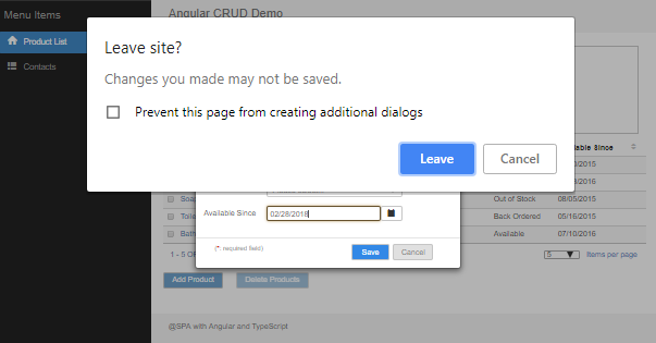
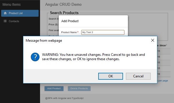
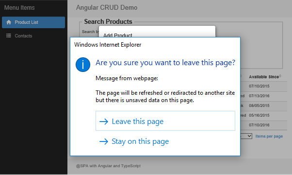
This route guard type of global dirty warnings then works fine as expected. On the Chrome, the same type of the dialog box is used for both Angular internal route and browser redirections. The browser built-in text messag is shown rather than those custom messages we place in the code.
For the IE 11, the dialog boxes for the Angular internal route and external browser redirections look somewhat different. But our custom warning messages are shown on the dialog boxes, respectively.
The dialog box shown for the Angular internal route redirections:
The dialog box shown for the external browser redirections:
Personally, I would still like the way of AngularJS for the route guard since it uses much less code and doesn’t need the method like canDeactivate in each route-related component classes. Hopefully the Angular NavigationStart event handler method will be updated with the option for cancelling the new navigation and staying on the current route.
Since the sample application is implemented with the on-change model updates and validations but partially using on-blur error message display, the dirty warning process always works without the “no last blur” issue. If you are curious about how the “no last blur” issue affects the global dirty warnings, you can reproduce the issue with these steps.
- Replace the product.component.ts and product.component.html in the app/PageContents folder with the files in the Test_Replacement/ProductComponent_OnBlur folder.
- Start the website, select Contacts from the left menu.
- Select Product List from the left menu, click Go button, and then click Add Product button.
- Enter any text into the Product Name fields.
- Directly move the mouse pointer to browser back button and click it.
The browser will be back to the Contacts page without any notice, whereas the expected result should be displaying a dirty warning dialog box. You can see the normal behavior after you copy back the product.component.ts and product.component.html from the Test_Replacement/ProductComponent_Final folder and repeat the steps 2 – 5 above.
Summary
As the Angular has been more mature, the development of a complex data CRUD business web application is becoming feasible especially with the reactive form structures. The sample application in Angular presented here has been migrated from the AngularJS version and all issues were addressed during the migration tasks. The article describes the implementation details and resolutions for most of the issues. Hope that the sample application and discussions can be a helpful resource for the web application development using the Angular. As usual, it’s my pleasure to share the code and my experience with the developer communities.
History
- 6/17/2018: Original post for sample application in Angular version 5.
- 8/10/2018: Added sample application in Angular version 6 and setup instructions.
- 9/7/2018: Added project type of ASP.NET Core 2.1 with Angular CLI 6. Rewrote the setup instructions. Re-structured download sources which include only source code in Angular 6. If you need the source code with the Angular 5 (only project types with Webpack and SystemJs available), you can download these here.
- 11/4/2018: Added project type of ASP.NET 5 with Angular CLI 6. Updated and simplified the setup processes of the sample application so that audiences can more focus on the real application content.
- 12/12/2018: Using the updated NgExTable and NgExDialog tools. Updated format of the articles. Updated NgDataCrud_AspNetCore_Cli project type setup structures with pure client-side configurations in the code and setup instructions in the article. If you would like to have the previous project source code with server-side
UseSpamidware, you can download the zip file here.


")


")


 CỦA OBJECTIVE (MỤC TIÊU)")
")